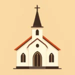
Christian Church Logos: An Overview of Emblems, Styles, and Branding
In the world of faith communities, a logo is more than a decorative mark. It is a concise visual statement that communicates identity, history, values, and mission. For churches, a thoughtfully designed emblem can unite congregants, help visitors recognize a place of worship, and convey a sense of reverence, welcome, and trust. This article offers a comprehensive guide to christian church logos, exploring the symbols behind emblems, the range of visual styles used in church branding, and practical guidance for designing, applying, and maintaining logos across diverse contexts. We will use variations of the phrase church logos—including parish logos, congregation insignias, and ministry emblems—to reflect the breadth of terminology you may encounter in conversations about church branding.
Historical context and the purpose of church emblems
From the earliest Christian communities to modern megachurches, logos have served as a shorthand for complex beliefs. In the early church, symbols such as the Ichthys (fish) or the Chi-Rho monogram carried meaning quickly even when literacy was low. As church life grew more organized, emblems began to function like seals, documents, and public signals—marking a place of worship, a sacramental community, or a charitable mission. Today, church logos operate in a global media ecosystem. They must perform under a variety of circumstances: signage on a building, a website header, social media avatars, printed bulletins, apparel, and interior décor. A successful emblem is not merely attractive; it is legible at small sizes, legible from a distance, culturally appropriate, theologically coherent, and adaptable across media.
Within a broader branding strategy, a church logo is part of a “brand system” that includes color palettes, typography, imagery, and voice. When these elements align, the logo becomes an anchor that grounds messaging and fosters a sense of trust and consistency across programs, ministries, and generations. The best church logos do not demand interpretation; they invite it, inviting people to pause, reflect, and recognize a place where faith is lived out in community.
Common symbols and their meanings in church logos
Across cultures and periods, church logos have converged on a core set of symbols with well-understood meanings. Below are some of the most common emblems you are likely to encounter, along with notes on how they are often used and interpreted in branding contexts.
Cross: The central emblem
The cross is the most universal symbol of Christianity. In church logos, it appears in countless styles—from crisp, minimalist outlines to richly ornamented forms. A cross may be presented alone or integrated with other elements to convey a particular emphasis: Ash cross for penitence, a cross entwined with a heart to stress love and mercy, or a cross placed within a circle as a symbol of eternity. Designers often adapt the cross to fit the church’s tradition, whether you’re aiming for a traditional liturgical vibe or a contemporary, high-impact look. When using a cross, consider how its line thickness, aspect ratio, and surrounding shapes affect readability in different contexts.
Dove and the Holy Spirit
Representing the Holy Spirit, the dove is a gentle, aspirational symbol used to evoke peace, renewal, and guidance. In logos, a dove can be rendered as a clean silhouette, a stylized swoop, or a more abstract sign of movement. When paired with water imagery, a dove can also speak to baptism and new life. Because it carries a strong spiritual resonance, the dove is often paired with a wordmark or a simple cross to maintain clarity in small sizes. A dove element typically communicates grace and divine presence without overshadowing other branding elements.
Ichthys (Fish) and early Christian identity
The Ichthys, or fish symbol, is one of the earliest Christian emblems. In modern branding, it can be stylized into a bold geometric mark or used as a negative-space motif within a circle or shield. The ichthys signals historic continuity and community belonging, which some congregations emphasize to highlight rootedness in faith traditions. It can work well for churches focused on teaching, outreach, or global mission, especially when paired with a modern sans-serif typeface to balance tradition with accessibility.
Chi-Rho and monograms
The Chi-Rho is a Christogram formed from the Greek letters Chi (X) and Rho (P). It is a compact, typographically rich emblem that can anchor a strong visual identity. Logos using a Chi-Rho often lean toward a heraldic or badge-like quality, suitable for churches with a sense of history, order, and formality. When integrating a Chi-Rho, designers pay attention to legibility at small sizes and consider whether to include additional text, such as the church name, beneath or around the symbol.
A lamb with a banner, a crown, or a victory motif appears in many logos to convey sacrifice, sovereignty, and eternal life. These symbols tend to be more ecclesial and liturgical, often used by denominations with a strong emphasis on tradition or public worship. While powerful, these images should be employed with care to avoid appearing overly triumphant or aggressive; balance with whitespace and a clear type treatment helps maintain a welcoming tone.
Fire, lanterns, and light imagery
Flames or lanterns symbolize illumination, guidance, and the presence of God as light in darkness. A flame motif can be minimal and modern or ornate and traditional, depending on the desired mood. When used in a series of branding materials, a consistent light motif—such as a small flame icon that doubles as a decorative accent—can create a subtle, cohesive brand language across print, digital, and signage.
Other notable symbols
Lamp of learning or open book: emphasizes teaching, discipleship, and the Christian call to study Scripture.
Anchor: conveys hope, steadfastness, and security; popular with churches emphasizing pastoral care and stability.
Tree of life or vine and branches: highlights growth, community, and spiritual nourishment.
Risen Christ imagery: conveys resurrection hope and pastoral leadership.
Hands or hands raised in prayer: communicates worship, care, and healing ministry.
Styles and visual language: how church logos communicate identity
The chosen visual language of a church logo conveys not only aesthetics but also theology, culture, and approach to mission. Here are common stylistic families you will encounter, along with guidance on when each style is appropriate.
Classic and traditional
Traditional church logos often feature heraldic shapes, shield forms, or architectural silhouettes that evoke historic worship spaces, liturgical seasons, and long-standing denominational lines. Typography tends to be serif-based, with careful, balanced spacing and formal proportions. Color palettes may include deep burgundy, forest green, gold, or navy to signal timeless values such as reverence, discipline, and covenantal continuity. For congregations tracing roots to historic streams, a classic logo can communicate continuity with the past and stability for the future.
Contemporary and minimalist
Contemporary church logos embrace simplicity, bold geometry, and a modern sensibility. They often rely on a single strong symbol (for example, a cross formed from negative space, a simple geometric shape, or an abstract mark) paired with a clean wordmark. The color palette is frequently limited to one or two confident hues, enabling strong legibility on digital screens and small print formats. This style tends to appeal to younger demographics, urban congregations, and communities prioritizing clarity, accessibility, and forward-looking mission.
Heritage and emblematic seal
An emblematic seal approach places the symbol within a defined boundary—such as a circle, shield, or badge—and often includes the church name or founding date. This style communicates authority, discipline, and a sense of official identity. It is well-suited for denominations with strong institutional branding, campus ministries, or networks that value a consistent, stamp-like presence across materials and facilities.
Abstract and geometric
Abstract and geometric logos use shapes, lines, and color blocks to suggest concepts without depicting a literal scene. This approach can convey ideas like growth, movement, and community without imposing a specific religious iconography. Abstract logos are versatile across media and can be highly distinctive, but they require thoughtful storytelling through accompanying typography and brand guidelines to ensure the intended message is understood by diverse audiences.
Monogram and lettermark
A monogram (often combining initials such as “C” for church and the name’s first letters) can yield a compact, highly legible mark for digital use and signage. Lettermark logos work well for multi-campus churches or denominations with long official names. The challenge is to maintain theological clarity while achieving a strong, memorable shape. When using a monogram, designers often incorporate modest symbolic cues—like a cross cut into a letter or a halo around a letter—to preserve meaning without clutter.
Color and typography in church branding
Color psychology and typography play a crucial role in how a church logo communicates its personality. The right combination can convey warmth, authority, grace, or dynamism, depending on the church’s mission and audience. Below are guiding principles to consider when selecting colors and typefaces for christian church logos.
Color psychology and selection
Blue often communicates trust, calm, and spiritual depth; it is widely used by churches seeking a reassuring, inclusive tone.
Gold or amber signals reverence, value, and transcendence; it can elevate a brand to feel sacred and prestigious.
Crimson or burgundy conveys tradition, sacrifice, and passion; it is common in denominations with strong liturgical rites.
Emerald/green evokes growth, life, and renewal, suitable for congregations emphasizing outreach, care, and creation care.
Black and white offers stark contrast, modernity, and clarity; often used in minimalist, modern logos for impact and legibility.
Combining colors with intentional hierarchy helps ensure accessibility, particularly for readers with color-vision differences.
When choosing a color palette, consider the church’s theological emphasis, community demographics, and the contexts in which the logo will appear. Consistency across digital and print materials is essential to maintain recognition and trust.
Typography: fonts and readability
Typography communicates tone as much as color does. Serif fonts often read as traditional, trustworthy, and formal, making them suitable for historic or denominational branding. Sans-serif fonts appear modern, approachable, and clean, fitting for contemporary or youth-oriented ministries. For logos, designers typically select a display version of a typeface or a custom wordmark that remains legible at small sizes. When pairing typography with a symbol, ensure that the typeface does not compete with the emblem for visual attention. Clear kerning, consistent letter spacing, and adequate whitespace around the wordmark all contribute to legibility across signage, websites, and social media.
Branding strategy and consistency across media
A church logo lives within a broader branding system. Consistency helps people recognize, trust, and remember a faith community. Below are essential elements of a cohesive branding strategy that harmonizes with church logos.
Brand guidelines: the rulebook for consistency
Logo usage rules: minimum clear space, preferred variants (full color, single color, monochrome), and prohibited alterations.
Color palette: primary and secondary colors, with exact color values for print (CMYK) and digital (RGB/HEX).
Typography policy: preferred fonts for headings, body text, and display use; alternatives for accessibility.
Imagery style: photography or illustration guidelines that align with the brand’s tone.
Voice and messaging: guidelines for tone in communications to maintain theological consistency and pastoral care.
Audience-centric branding
Effective church branding meets people where they are. This means understanding diverse audiences—long-time members, seekers, families, students, and seniors—and designing logo systems that remain welcoming across ages and backgrounds. For example, a multi-campus church may opt for a strong central symbol with campus-specific taglines, allowing for local relevance while preserving a unified identity. A youth-focused ministry may deliberately choose a bold, minimalist mark and a vibrant color accent to signal energy and openness, while a traditional parish may lean into a refined emblem with heraldic cues to honor its roots.
The logo creation process for Christian churches
Designing a logo for a church is a collaborative process that blends theology, culture, and aesthetics. Here is a practical, step-by-step framework that many congregations find helpful. The process emphasizes listening, iteration, and stewardship—recognizing that a logo is a public, enduring asset.
Discovery and briefing
Clarify the church’s mission, values, and vision.
Identify target audiences, including regular attendees, visitors, families, students, and neighbors.
Audit existing branding elements, including signage, apparel, worship materials, and digital presence.
Define constraints such as budget, timelines, and accessibility requirements.
Symbol selection and concept exploration
Generate a diverse set of concepts that reflect theological themes (grace, mission, liturgy, service) and community life.
Explore variations that combine symbols with typographic marks (e.g., cross + name, Ichthys with initials).
Develop initial sketches in black-and-white to prioritize shape, balance, and legibility before adding color.
Design development and refinement
Transform the strongest concepts into refined digital versions using vector graphics to ensure scalability.
Evaluate legibility at multiple sizes (from social media icons to large signage) and in different contexts (print, screen, embroidery).
Solicit feedback from pastoral leadership, communications teams, and, if appropriate, church members or stakeholders.
Deliverables and implementation
Produce a logo kit with primary logo, secondary logo, and icon mark variants, plus guidelines for usage.
Create accessible color and typography files for print and digital media.
Prepare applications for signage, website, bulletins, social media, apparel, and gift items.
Evaluation and evolution
Monitor reception and consistency across channels; be prepared to refresh branding while preserving core identity.
Solicit ongoing feedback from staff and congregation and adjust guidelines as needed.
Case studies and practical examples of church logos
While every church is unique, certain patterns appear frequently across denominations. The following vignettes illustrate how the choice of emblem style, color, and typography can reflect a church’s theology and community life. Note that these case studies are conceptual and representative rather than about any specific institution.
Case study: a legacy Episcopal-style parish
The emblem employs a shield format with a balanced combination of a cross and a dove, rendered in a restrained palette of navy, gold, and white. The typography uses a classic serif with generous spacing, signaling liturgical heritage and pastoral authority. The seal-like badge communicates stability and fidelity to tradition while remaining legible on banners and bulletins. Across digital channels, the same marks maintain dignity and accessibility, reinforcing trust for long-time members and newcomers alike.
Case study: a contemporary urban church
A bold, monogram-based mark sits above a sans-serif wordmark. The primary color is a bright teal paired with charcoal, conveying freshness, inclusivity, and an orientation toward community impact. The symbol sits on a clean white field with ample negative space, making it instantly recognizable on screens, apps, and street signage. The overall effect is approachable and energetic, appealing to families, students, and professionals in a city context while still honoring Christian symbolism through the use of a cross or subtle arc within the monogram.
The logo combines a tree of life motif with a shield outline, using green and earth tones to emphasize creation care and hospitality. The typography is a legible serif with gentle curves that evoke warmth and reliability. The design integrates a small emblem of a lamp or flame, suggesting guidance and outreach. This branding supports a strategy focused on community service, environmental stewardship, and neighborhood partnerships, making it suitable for mission-driven programs and local collaborations.
Best practices and practical guidance for logo use
To maximize the effectiveness of a church logo, teams should follow practical guidelines that preserve integrity, ensure accessibility, and sustain impact across contexts. Below are considerations and recommended practices that help maintain the strength of christian church logos.
Readability and scalability
Test the logo at small sizes (email signatures, app icons) and large formats (billboards, campus banners).
Ensure a robust monochrome version for contexts with limited color printing or single-color embroidery.
Avoid intricate details that vanish when scaled down; favor clean shapes and clear line work.
Accessibility and inclusive design
Use high-contrast color combinations to accommodate readers with visual impairments.
Provide text alternatives for logos used in environments where color variations may be limited.
Be mindful of the symbolism’s inclusivity across diverse cultures and communities; verify that symbols do not inadvertently exclude or misrepresent groups.
Consistency across materials
Use the approved logo variants consistently: specify when to use full-color, one-color, or reverse (light on dark) versions.
Maintain consistent spacing around each logo—defined clear space—to prevent crowding with other elements.
Provide ready-to-use assets in multiple formats (SVG for vector scalability, PNG for web, EPS for print).
Digital context: logos in websites, apps, and social media
In a digital-first world, logos must perform well on screens, from tiny favicons to large hero images. Here are considerations for digital usage:
Favicons: create a compact, unambiguous version of the emblem that remains clear at small sizes.
Social avatars: ensure the icon is legible when displayed at profile sizes; often this means using the emblem or a bold monogram rather than a detailed scene.
Responsive design: provide alternative layouts for different breakpoints (for example, a compact mark for mobile and a fuller version for desktop headers).
Accessibility: include alt text that concisely describes the emblem’s significance for screen readers.
Incorporating church logos into branding materials
A well-designed logo is a doorway into a broader brand system. Consider how the emblem integrates with other branding elements such as photography, illustration, and typographic hierarchy. The emblem should anchor the overall composition while allowing space for worship schedules, program names, and event details. In brochures, the logo should harmonize with photography that reflects the church’s community life—families in worship, outreach activities, and intergenerational gatherings. For signage, the logo must read clearly from a distance and at eye level, with appropriate lighting and contrast. On apparel, embroidery and screen printing require simplified forms that retain legibility while reflecting the brand’s tone.
Common pitfalls to avoid when designing or refreshing a church logo
Logo design for a church bears responsibility: it should invite people in, respect tradition, and avoid misinterpretation. Some common missteps to watch for include:
Overcomplication: unnecessary details reduce legibility and hinder reproduction across media.
Inconsistent iconography: introducing multiple, competing symbols without a unifying theme fragmentation.
Over-reliance on trends: choosing a style that looks dated after a few years; aim for timelessness with capacity for future evolution.
Cultural insensitivity: symbols or color choices that may be misread or alienate certain communities.
Inadequate accessibility: insufficient contrast, small type, or color combinations that are challenging for some viewers.
Conclusion: embracing logos as living tools for ministry
A well-crafted church logo is more than a decorative mark; it is a living tool that communicates identity, invites participation, and supports a church’s mission across time and place. When designed with theological integrity, practical usability, and a deep respect for the community, a church emblem can unify a congregation, help newcomers feel welcome, and anchor narratives of grace, service, and hope. The most effective logos do not attempt to replace the church’s story; they become a concise visual summons to that story—one that is legible, scalable, and enduring across generations.
As you consider christian church logos for your own community, remember that a successful logo is the product of discernment, collaboration, and stewardship. Engage pastors, lay leaders, designers, and congregants in a process that honors history while inviting new energy. The result should be a visual identity that communicates clearly, grows with integrity, and remains faithful to the gospel it seeks to proclaim.
Key takeaways
Emblems and symbols carry deep theological meanings; choose those that align with your church’s beliefs and mission.
A consistent branding system—logo, color, typography, imagery—builds recognition and trust.
Consider accessibility, scalability, and versatility across print and digital contexts.
Use a structured design process with clear milestones, stakeholder input, and real-world testing.
Embrace logos as living tools that support ministry now and adapt thoughtfully in the future.
Whether you are updating an existing emblem, creating a new logo from scratch, or building a brand system for a multi-campus church, the guiding principles outlined in this guide can help ensure your church branding communicates warmth, wisdom, and authenticity—today and for years to come.