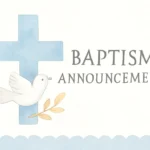
A church poster is more than a decorative flyer. It is a concise, visually engaging communication tool designed to inform, invite, and inspire a faith community. Whether it is announcing a weekly service, a special event, a sermon series, or a community outreach effort, a well-crafted poster can guide attention, set the tone, and provide essential details at a glance. In many congregations, community members first encounter information about programs and services through a wall display, a hallway bulletin board, or a digital sign that echoes the same visual language as a physical poster. The term “poster” here embraces a range of formats—from large printed banners in the sanctuary to smaller handouts placed in foyers and welcome desks, and even digital posters shared on church social media and newsletters.
Throughout this article, you will encounter variations of the central idea—the church event poster, the parish bulletin card, the worship poster, and the faith-inspired flyer—all of which share common design essentials while serving different purposes and audiences. By exploring design ideas, printing tips, and free templates, you’ll gain practical guidance to create posters that are not only beautiful but also highly functional for your church.
Design Principles for Church Posters
The success of a church poster hinges on how clearly it communicates its message and how well it aligns with the community’s identity. Below are core principles that apply to any denomination or service style. Consider them as guardrails that help you balance aesthetics with practicality.
Clarity, Contrast, and Information Hierarchy
A strong poster makes the main message immediately obvious. Use a clear hierarchy to guide the reader from the most important detail to the supporting information. Start with the event or message title in a bold, legible typeface, followed by a short subtitle or tag line, the date and time, and then practical details such as location, contact information, and a call to action. In practice:
Headline — 1 to 2 words or a short phrase that captures attention.
Subhead — a brief line that clarifies the purpose.
Details — date, time, venue, doors open, RSVP info.
Action — a call to action such as “Join Us,” “RSVP Today,” or “Visit Our Website.”
Use high contrast between text and background to ensure readability from a distance. For example, light text on a dark background or dark text on a light background. Reserve busy patterns for secondary elements and ensure they do not obscure essential information.
Typography: Readability and Tone
Typography communicates personality as well as legibility. When choosing fonts:
Limit font families to two or three per poster—one for the headline, one for body text, and one for a potential accent.
Choose readable faces with generous letter shapes, especially for outdoor or hallway signage (serif fonts can be elegant for traditional churches, sans-serif often works well for contemporary ministries).
Adjust tracking and leading to improve readability at distance. Tight letter-spacing can be risky for posters viewed from far away.
Consistency across formats to preserve brand identity. If your church uses a logo, the same color palette and typography should appear across all materials.
Color Theory for Sacred Spaces
Color can convey mood, season, and reverence, but it can also overwhelm if not used carefully. Consider:
Seasonal palettes that reflect liturgical seasons or community emphasis (e.g., greens for growth, purples for penitence, gold for celebration).
Brand consistency with church logo and existing materials.
Accessible color combinations to accommodate members with color vision deficiency; avoid relying on color alone to convey information.
Imagery and Iconography
Photos, illustrations, and icons should reinforce the message and avoid clutter. Consider:
High-quality imagery that reflects authentic moments from worship, service projects, or community life.
Icon sets for universal information (location pins, calendar icons, QR codes).
Respectful framing of sacred themes—avoid overused clichés while maintaining warmth and welcome.
Planning Your Church Poster Project
Before you jump into layout and design, a well-planned process increases efficiency and ensures the final piece serves its purpose. This section covers practical steps to prepare for a church poster project.
What is the primary purpose of this poster? (Announcement, invitation, educational message, fundraiser, outreach, or volunteer recruitment?)
Who is the target audience? (Families, youth, seniors, newcomers, current members, or a specific ministry group?)
What action do you want the reader to take? (Attend, sign up, donate, learn more, or share information?)
The answers shape tone, wording, and imagery. For instance, a worship poster for a Sunday service may prioritize accessibility and warmth, while a parish outreach poster might emphasize call to service and community impact.
Poster Sizes, Formats, and Distribution
Determine where your poster will appear and what size works best. Common formats include:
A3 or A2 posters for community boards and foyer display.
A4 handouts that visitors can take home or share with friends.
Banner sizes for outdoor signage or large hallways.
Social-ready variants sized for Instagram square, Facebook banner, or story formats to maintain consistency across channels.
Consider printing a master poster and then producing scaled-down versions for smaller spaces. In multi-site churches or campuses, adapt core design elements to reflect each location’s identity while preserving the overarching visual system.
Accessibility and Inclusivity Considerations
Accessibility ensures that information is available to as many people as possible. Basic considerations include:
Large, legible type with a minimum font size that remains readable at distances typical of the display location.
Alt text or clear labeling for online variations so screen readers can interpret the content.
High contrast between text and background, and sufficient color contrast for those with impaired vision.
Inclusive imagery featuring diverse participants and settings that reflect the community.
Design Ideas for Different Purposes
A successful church poster can serve many roles—each role benefits from tailored design ideas that remain anchored in a cohesive visual language. Here are practical ideas for a range of common purposes.
Event Announcement Posters
Event posters are perhaps the most common form of church communication. They should immediately tell readers the event, why it matters, and how to participate.
Headline approach: Use a concise, active verb and a benefit statement (e.g., “Join Us for an Evening of Worship”).
Visual anchors: A single striking image or graphic that captures the event’s essence (a microphone for a concert, a candle for a vigil, etc.).
Practical details: Date, time, venue, RSVP method, and any age restrictions or admission specifics.
Connection points: QR codes or short URLs leading to registration or event pages.
Sermon Series Posters
For sermon series, posters should hint at the theme while encouraging ongoing engagement over several weeks.
Series branding: A unifying color palette and typographic motif that carries through all posters in the series.
Sequential layout: A layout that can be easily updated weekly with the specific sermon title and scripture reference.
Scripture emphasis: A short, memorable verse or theme phrase that anchors the design without overwhelming the layout.
Outreach and Community Service Posters
Posters for outreach focus on invitation and impact. They should emphasize concrete opportunities to participate and serve.
Clear call to action: “Volunteer this weekend,” “Help feed the hungry,” or “Join a local project.”
Impact imagery: Photos or icons that illustrate the benefit of getting involved (packing bags, delivering meals, tutoring children).
Safety and inclusivity notes: If volunteering involves risk or prerequisites, include brief, clear instructions.
Volunteer and Donation Posters
Motivating volunteers and donations involves emphasizing community, shared purpose, and tangible outcomes.
Impact metrics presented succinctly (e.g., “100 meals delivered this month”).
Volunteer roles and contact points, with a sense of welcome and belonging.
Donation instructions if relevant—how to give, what funds support, and where to direct contributions.
Seasonal and Liturgical Posters
Seasonal themes bring color and rhythm to church spaces. Posters aligned with liturgical seasons help unify the church year and provide timely reminders.
Seasonal motifs that reflect Advent, Christmas, Lent, Easter, or ordinary time while remaining appropriate for your community’s style.
Calendar integration: Tie posters to church-wide calendars or community activities around the season.
Minimal copy to keep the focus on the moment of the season and the church’s mission.
Typography and Layout Guidelines for Effective Posters
The typography and layout of a church poster determine how easily the message is read and remembered. The right combination of type, alignment, spacing, and imagery makes a poster feel intentional and persuasive.
A clean grid helps you align elements consistently, producing a professional, cohesive look. Whether you are using a traditional grid or a modular approach, consider:
Margins and padding to prevent crowding along the edges.
Consistency in alignment (left-aligned text for body copy, centered headlines, or a fixed column approach).
Visual rhythm created by repeating elements such as icons or a page header across multiple posters in a series.
Whitespace as a Tool
Don’t crowd information. Use whitespace to create breathing room, especially around the headline and the call to action. Effective whitespace helps readers focus on key details and prevents fatigue.
Brand Consistency and Identity
If your church has an established brand or logo, reflect it in all posters. A consistent color palette, typography, and layout system reinforces recognition and trust among your congregation.
Printing Tips for Church Posters
Printing is the bridge between design and physical presence. Here are practical tips to ensure your posters look as good in print as they do on screen.
Choose materials based on where the poster will be displayed and the expected longevity.
Paper posters (matte or gloss) are suitable for indoor display on walls, boards, or windows.
Vinyl banner posters are ideal for outdoor or high-traffic areas, with weather-resistant properties.
Mesh banners work well for large outdoor signage where wind may be a factor.
PVC or foam board mounting for freestanding displays in lobbies or hallways.
Resolution, Bleed, and Color Management
To avoid blurry images or color shifts, prepare print-ready files with proper resolution and bleed:
Resolution: 300 DPI at final print size for sharp text and images.
Bleed: Include a 1/8 inch (3 mm) bleed beyond the final trim size to ensure edge-to-edge printing without white margins.
Color mode: Use CMYK for print accuracy unless your printer specifications require a different workflow.
Proofing: Request a soft proof (PDF) and a physical proof when possible to catch color and layout issues before mass production.
Finalizing and Finishing Touches
Finishing touches can elevate a poster from good to memorable. Consider:
Laminate or coating for durability in high-traffic areas or outdoor use.
Rounded corners for a polished, professional look (common in indoor posters).
Mounting options such as frames, magnetic boards, or adhesive options suitable for your space.
Version control to maintain consistency across multiple posters and avoid mixed messages.
Free Templates and Resources for Church Posters
Free templates can accelerate the poster creation process while maintaining a strong design standard. Use templates as a starting point and customize them to fit your church’s branding. This section highlights general sources and practical tips for using free resources responsibly and effectively.
Where to Find Free Templates
Several reputable platforms offer free church poster templates that cover a range of formats—from printable sheets to social-media optimized designs. When selecting a free template, verify that it supports:
Editable text so you can insert event details, scripture references, and calls to action.
Customizable color palettes aligned with your church’s branding.
Print-ready formats (PDF, TIFF) and web-ready variants (PNG, JPEG) for digital channels.
License terms that permit church or nonprofit use and that allow modification.
Common sources for free templates include generic design platforms and church-focused resources. When using these templates, replace placeholder content with your own messaging and imagery to maintain authenticity and avoid cliché religious stock imagery.
How to Customize and Adapt Templates
Customization is where you make a template uniquely yours. Practical steps include:
Swap imagery with photos of your congregation, facilities, or worship moments to reflect real life in your church.
Adjust typography to match your standard fonts and ensure readability at the intended viewing distance.
Modify color schemes to align with your brand guidelines or liturgical season.
Localize content by adding location-specific details, service times, and contact information.
Example Template Descriptions
While templates vary by platform, here are common features you might encounter and how to adapt them:
Event poster template: A bold headline, a hero image, space for date/time, venue, and a QR code. Adapt by substituting with your own event photo and updating the critical fields.
Sermon series poster template: A themed visual motif that repeats across multiple posters with week-specific sermon titles. Replace the series name and sermon title as weeks progress.
Volunteer outreach poster template: Emphasizes call to action and impact statistics. Swap the statistics with real numbers and adjust the contact method.
Real-world examples can illuminate best practices and common challenges. The following hypothetical case studies illustrate how different churches may approach poster projects with varied needs.
Case Study A: A Multigenerational Church Launching a Family Night
Objective: Invite families to a monthly Family Night with worship, games, and a light meal. Audience: Families with children of all ages. Key messages: “Family Night,” family-friendly activities, time, and location. Design approach: Bright, friendly color palette; bold headline; kid-friendly imagery; clear RSVP instructions. Printing plan: Indoor posters for foyers and parking lot signage for the event night. Result: Increased family participation and a steady RSVP rate over three months.
Case Study B: A Small Rural Church Promoting a Community Service Day
Objective: Recruit volunteers for a once-a-month service day. Audience: Local residents and church members. Design approach: Simpler poster with high-contrast type, one strong image of volunteers, and a prominent sign-up QR code. Accessibility: Large text, straightforward copy, print on durable vinyl for exterior display. Result: Higher turnout for the service days and a growing pool of volunteers from the community.
Common Mistakes to Avoid
Even with good intentions, posters can miss the mark. Here are frequent errors and how to prevent them.
Too much text — If readers cannot absorb the essential details in a few seconds, revise to emphasize the core message and relocate ancillary information to digital channels.
Poor contrast — Low readability due to insufficient contrast between text and background undermines accessibility.
Inconsistent branding — Mixed fonts or colors across posters create confusion and reduce recognition.
Inaccurate or missing details — Always double-check date, time, location, and RSVP instructions before printing.
Overly generic imagery — Choose images that reflect your specific community rather than stock visuals that feel distant.
How to Integrate Posters with Other Church Communications
A poster is most effective when it is part of an integrated communication ecosystem. Think about your church’s broader channels: digital signage, the church website, social media, newsletters, and printed bulletins. An integrated approach ensures consistency and reinforces the message across touchpoints.
Unified visual language across posters, slides in worship services, and digital banners.
Cross-channel calls to action—a poster might invite readers to RSVP via a website, a social post, or a prayer request form.
Content repurposing — reuse copy and imagery in multiple formats for efficiency and consistency.
Conclusion: Start Simple, Think Strategically, and Iterate
A compelling church poster blends clarity, character, and care. By starting with a clear purpose and audience, applying solid design principles, and choosing the right printing approach, your posters can become powerful tools for worship, outreach, education, and service. Remember that the ultimate measure of a successful church poster is not only how it looks but how well it helps people engage with your church’s life and mission.
Next Steps: A Quick Checklist
Define purpose and audience for your poster.
Choose format (print size, display location, digital adaptation).
Create a layout using a grid, a clear hierarchy, and accessible typography.
Select imagery that reflects your community and message.
Apply color thoughtfully to evoke the right mood while maintaining legibility.
Prepare print-ready files with the correct resolution, bleed, and color mode.
Test and proof the design in print and in situ to confirm readability and impact.
If you plan to explore more, consider compiling a small library of templates tailored to your church’s needs—covering event announcements, sermon series, outreach promotions, and seasonal campaigns. A structured set of semi-custom templates can dramatically shorten production time while maintaining a consistent and recognizable visual voice.
Glossary of Terms
For readers new to print design, here is a short glossary of terms frequently used in church poster production.
: Extra image or color area beyond the final trim size to avoid white edges after cutting.
: Color model used for printing, representing cyan, magenta, yellow, and black.
: Dots per inch, a measure of image resolution.
: The arrangement of elements to guide the reader through the poster from most important to least.
: A test print used to check for errors before final printing.
By approaching church poster design with these ideas in mind, you can craft communications that are not only visually compelling but also deeply effective in fostering community, participation, and spiritual growth.